How write.freely New User's Guide was made.
Letter to a Friend, describing how a project came to be :
Later in the day, I relaxed to some nice music, and wrote a reply letter to K., who is my penpal via the wonderful Slowly app. She is cool, a great writer and reader, interested and following my blogging closely.
Poor K. will be getting another LONG letter, but she will know the main reason for such length and detail is that I thought it would work equally well for a Blog post.
Describing the whole process I worked thru, from a raw webpage View Code, HTML source, through the various steps to turn it into an editable and nicely formatted Blog post.
In a different language but equally useful for new users (now, in English, potentially reaching a large audience).
So, here it is. Just sent the letter, and it will be in the Blog hours before she receives it. But fist a little background info.
Background Info – Write.freely new users guide post :
Finally came across a nice Write.freely new users guide (in French language). The Guide was prepared by Ange, and meant to help people using the write.freely instance at TeDomum.net, home for my blog.
![]()
Since there's not much documentation, I decided to take Ange's Guide and prepare an English translation, post it on my blog and spread the word.
- Originally posted by @angedestenebres – @angedestenebres@mastodon.tedomum.net in Mastodon.
- Original posted in French at TeDomum Wiki Documentation
- An interesting project, diving into this and seeing the complex code generated by the Wiki for a typical page.
The English version is now live here at TeDomum Write.Freely itself.
The Letter itself :
Hei K.!!
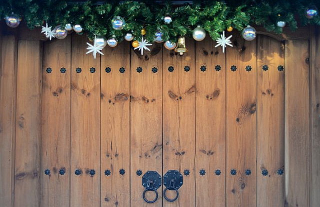
LOL, sorry for the inappropriate use of the garland, but that is not my tree, or my house either. It is a photo a friend in Romania sent me with a letter. Sent that photo to a few friends here in Slowly.
Had fun today, created a new blog page that I think might get some good stats for viewing.
I found a nice new user's Guide for the write.freely software I use, at the blog's home Wiki pages. Thing is, the system is in France, and all their documentation is in French, ma aussi.
Still – it looked like an interesting project; I did not have access to the plain text of the Wikipage, but grabbed the HTML source from viewing the page in the browser; and started trying to make sense of it. Owa! :)
It was quite gnarly, not made to be human readable, no spaces or line breaks in the big DIV branch that nested the whole page content. And even there, each line had a lot of references, time stamps, etc, from the wiki creation tool, I think.
Editing and cleaning the source :
But you know me, it was a neat challenge. So I copied that part right off the browser source code viewer, opened a new tab in my text editor, dumped it there. Then saved this, raw first data grab, and saved to a new name for editing – so I could go back to it if I messed something up.
First stage was breaking some paragraphs so I could read and understand the code (it makes sense, but not without any line breaks or even a single space between all the pieces that make up the page.)
Once I had the paragraphs broken up, I copied the text and pasted on a new Blog draft page – to see how things were progressing as I edited and changed it. At first no images at all were displayed (her source had 11 images, all in PNG format); the reason being this code was too complex for the write.slowly editor to present into a blog page.
No worries, it was just the first try; just a question of more cleaning up needed.
Replacing HTML with MarkDown tags :
I started from the top, and replaced the Heading codes from HTML (H1, H2, H3, etc) to the equivalent text sized Markdown ones (simply a hash mark at the beginning of a line; # gives same as H1, etc), which are super simple and unclutter things really well.
Love this new Markdown language, such a great idea – I just started learning it a couple of weeks ago, and have been making much progress and enjoying it.
Other HTML tags also replaced and cleaned up. The images had big blocks of html, with no referrer, etc inside it; once I changed them to the plain Markdown image tags, they displayed perfectly as expected.
An image is inserted like this example; not bad at all:

I just made some good black coffee (Dark Roast, freshly ground, yummy), had a nice Jazz radio stream in Spotify, and edited away, frequently saving, then sometimes copying over to the blog draft, saving to see how it looked. Progress was apparent. :)
If you wonder why I am going into so much detail, well, guess what? Think this is a nice next page to post at the Blog, as it describes this process of converting a live web HTML page to editable format again.
Will be posting it tomorrow, Friday.
Ange did a really nice job, illustrating her guide with Screenshots as she moved along the text, very nice and helpful for new users, the intended readers. I kept all the original French text until I had cleaned all extraneous html from the file, and it displayed perfectly.
Translating the text :
Only then I went to work on creating a translation, at this point much easier since all the text was readable. Saved as another name (I do have maybe 4 edits saved, at different stages), so I would not mess up and have to redo from much earlier stages.
With all headers and images insertions formatted in MarkDown, it was time for the text translation. I do understand French, much better than I cna speak it; it has been a long time since I had French classes. I copied a couple of paragraphs at a time, pasted then into my favourite Bing Translator tool, and copied back the English output.
The translated text was quite nice, needing little revisions for corrections or more usual style. Working this way, in stages, was easier than trying to handle a large part or the whole page.
And that went well. Once completed, I copied the whole into the Blog editor, and saved; it displayed properly, a few little glitches to be corrected (when you mistype a closing tag, mostly).
Almost done!
Processing the images :
Uhm... Except the images, the same ones Ange has, did not display as well in the blog. Why? The Wiki is formatted to use a normal desktop screen, and some of the images were quite wide, being crops from her own desktop screenshots.
The write.freely software shows a centered column of text in my desktop or laptops. That column is 640 pixels wide, and the reason for displaying it in that format is simply to make it work in both desktop and mobile browsers equally.
I was very pleased a couple of days ago, when I looked at the blog in my mobile phone. It displayed perfectly, sharp and with the same style it shows on my laptop. Really neat, and I can forgive the wasted columns spaces in the laptop, if it allows such a nice and easy compatibility with mobiles; so many people are all about these, can't ignore those users.
OK, so what to do? Image editing time!
Image Editing :
I downloaded all 11 images (noticing how neatly she simply named them 1.png, 2.png and so on). Once all where down on my work folder, I opened one at a time. Looked for any possible or needed cropping (to eliminate some white space if possible), and once cropped if needed, went on to re-saving them. And after a save — resize them for optimal blog display.
Since the blog defaults to 640 pixel wide columns, the ideal image size is also 640 pixels, so down scaling is not needed if the image is larger. Keeping that in mind for all my posts, so it display faster and nicer quality images.
My image editor of choice is freeware, simple and easy to learn one, which happens to be quite powerful too. Irfanview, and I have used it for years. Once you learn the basics, it just works like a nice hand tool, sharp and ready for use.
So I touched all the image files, resizing after any crops needed. Then uploaded them to my favourite image host (which took me a day of research to find, so many lesser featured ones).
Once each image was uploaded, one at a time, I would grab the new image URL, copy it and replace the old location in my draft text.
That part was fun too, all of this project was in fact. :)
Final Touches; then Promoting the new post :
And once this all was done, tested and in the blog host, I just needed a nice image for the page head, which I searched for and found with Bing Images. Crop, resize, upload, edit in the URL and presto, a new blog page complete.
Done, eh? Well, I was done for the web-mastering part; only remaining was announcing the post. I have a method for that already tuned as well.
I prepare yet another little text file, name it blog announce – title, date.txt and compose a little piece inside I can copy and paste into Twitter, Mastodon instances announcing new content (about 5 of them).
Today's announce was this text :
* Write.freely blog – a guide for new users *
Ange made a nice and illustrated guide for new users of Write.freely blogs, but it's all in French.
Goal is to help people interested in using the write.freely instance at TeDomum.net — which has been my blog's home. This morning I took some time and translated her guide to English.
Now the page is on my blog: https://write.tedomum.net/rgx/write-freely-wiki-documentation
In Twitter you can only use a short 240 characters, while in Mastodon instances it is minimum 500 chars, sometimes much more. So I might have a very short one like above, and maybe a longer one for Mastodon places, if it makes sense to have more text, longer quotes, or multiple links.
So now I have explained the whole process and hopefully not bored you to death, lol... :)
I am really thinking of the blog audience as I type here, the detailed description could help someone with the patience to read thru and understand it.
So, time to hit the send button, Kali. :)
Check out today's page in the blog, the link is in this paragraph above.
Have a good week and enjoy the Holidays; Happy New Year!
Till next time, sincerely yours,
rgx.
Thank you for reading this, please feel free to comment about this post, your input is important. This page created entirely in MarkDown language.