The Subversive Genius of Extreme Slow Email

An article about a new and interesting service :
Every day, the mail still comes. My postal carrier drives her proud van onto the street and then climbs each stoop by foot. The service remains essential, but not as a communications channel. I receive ads and bills, mostly, and the occasional newspaper clipping from my mom. For talking to people, I use email and text and social networking. The mail is a ritual but also a relic.
That relic is also the model for a new personal-communication app called Pony Messenger. Think of it as email, if email arrived by post: You compose a message and put it in an outbox; once a day (you can choose morning, afternoon, or evening “pickups”), Pony picks up your outbound dispatches and delivers your inbounds. That’s it. It’s postal-service cosplay. It’s slow email.
The article on The Atlantic is well written and even mentions SLOWLY and other slow tech apps and services.
Ben Grosser created the Minus social network, on which you can post only 100 times. Other technologies of unhurriedness include Dialup (a surprise-phone-call app), Slowly (a pen-pal service), and Mail Goggles (a Gmail add-in to prevent email regret).

I thought it interesting, worth a mention here
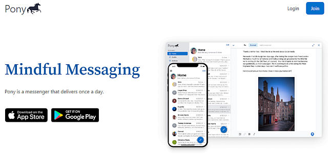
Pony Messenger for example allows some niceties I am still waiting to see (maybe) in our SLOWLY platform. Like some Rich Text formatting. They show in-line images for example – images inserted in the middle of the message's text, which can make them more relevant.
Screenshot from Pony Messenger's website :

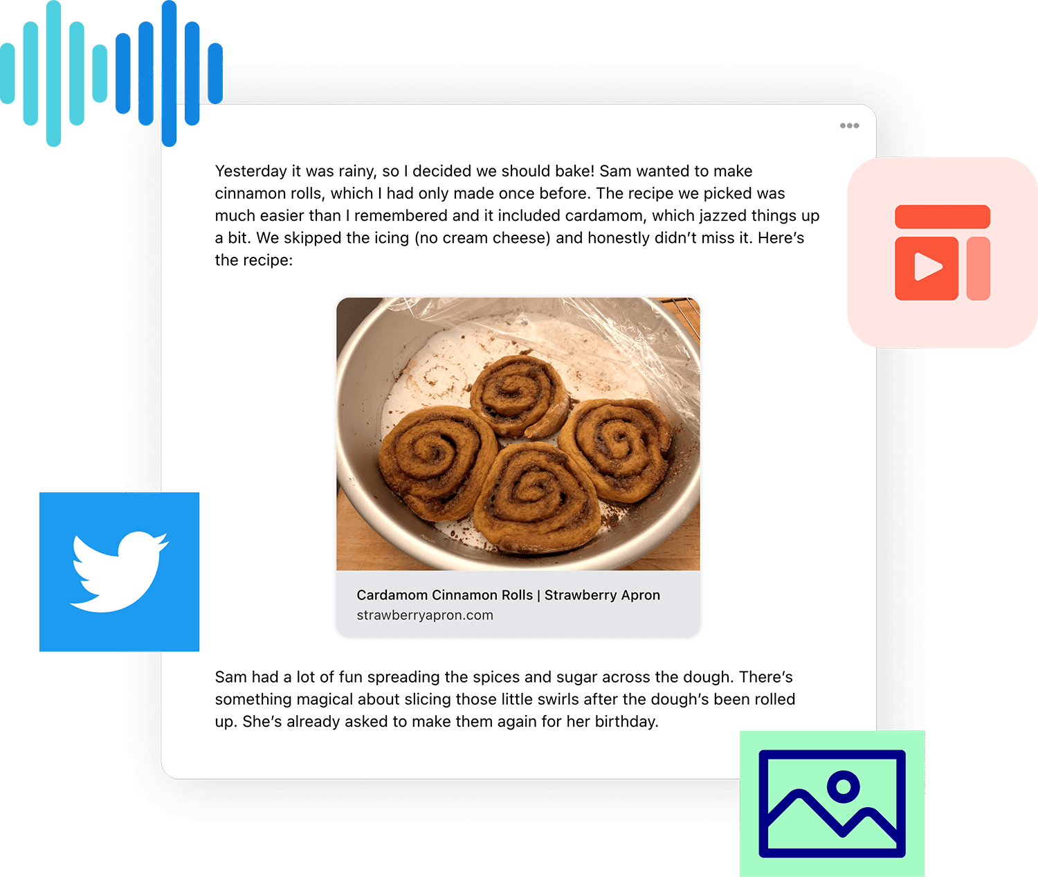
And it allows sound recordings for those wanting them as well.
Get creative
Compose in a rich, modern editor. Express yourself with embedded images, links, and audio files.
Service is available on iOS, Android or via Web Client
A post by it's author, Dmitry Minkovsky, on Hacker News briefly describes the main points about this app and service :
Pony is a messenger without a send button. When you're finished composing a message, instead of sending it right away, you put it in your outbox. Once a day—in the morning (5:30am), afternoon (12:00pm), or evening (6:30pm)—Pony picks up anything that's in your outbox and delivers any new messages that may have arrived. You can edit a message until it's picked up, move it into drafts, or delete it altogether.
I built Pony because email makes it hard to keep up lasting correspondences with people. I think the main reason for this is because email is dominated by “transactional” communication—time-critical messages that are tied to some particular interaction: order confirmations, password resets, etc. All of these things tend to bury interpersonal correspondence. The same goes for texting and chat platforms: they may be good for keeping in touch with people and for making plans, but messages come and go quickly and they're not really spaces designed for more thoughtful correspondence.
Pony, on the other hand, encourages thoughtful communication and acts as a barrier to anything time-sensitive. It's a highly predictable space and unless you've received a delivery, you know that when you open the app, nothing will have changed. And although Pony encourages you to take your time and not communicate reflexively, it also sets a “micro-deadline” every day, which creates structure that helps keep the correspondence going.
I've started a blog, if you're interested in reading more. (RSS feed is available here.)
If you like this concept, please sign up and try it out! It's available for iOS, Android, and the web. This is a completely self-funded project. You can contribute inside the iOS app using In-app Purchases or in the web app using Braintree/PayPal. You can also buy me a coffee.
Tried it, the user interface is simple and functional.
The new message editor is plain text by default – a simple panel with minimal distractions (good).
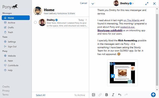
At the bottom though, you find the Rich Text formatting tool buttons I wish could be present on SLOWLY as well. Those include : Bold, Italic, Linking to any URL, Image Insert.
A snapshot of the Compose panel with some Bolding, some URLs inserted a well as an inline image:

Larger image here if desired.
A quick note
The Compose screen on my laptop is WAY wider than shown in the screen capture above.
I resized the window much narrower than normal, to make the screen capture a better format for posting here as a screen cap.
See a full sized, normal compose window screen cap here. (1600x739 pixels, 21 Kb)
There's also a small button at the top right on the Compose window – and pressing that makes the Editor maximized, full screen width, with no distractions at all on the left side. (full size screencap here, 1600x802 pixels, 8 Kb)
A great idea and way to concentrate on the all important Words.
There are many nice things here, specially on the rich text formatting features offered, and the clean, uncluttered screen layout. I wish our Slowly Team would look at these and consider them for the app.
Famous Last Words
Special thank you to all the folks behind the SLOWLY app.
Letters we share, with pen pals all over the world. A modern day take in the traditional penpal experience. Come and join us, using SLOWLY.
Follow Blog via your Fediverse/Mastodon account :

@friends-near-and-afar-letters-we-share@wordsmith.social
This page created in MarkDown language. Thank you for reading, feel free to comment, via a direct message to my Twitter account – or the Reddit one.
You can also post a public comment in the Reddit thread for it here.
 yann2@bsky.social