Slowly Web – Font in use? Could I change it?

Type is Beautiful
I have always liked Typography – the study and use of different styles of fonts for projects, ranging from a flyer to a newspaper or magazine page, to a full blown book.
There are many beautiful fonts, and today we have easy access to them – many can be acquired and installed in our own computers without cost.
Recently I have started on a Web Development course online, and this opened up many new and interesting paths. Like looking under the hood and seeing how a website is built, how they achieve any particular effect or feature.
Which includes the Styling, done via CSS properties. Any modern web browser offers Developer's Tools, usually a F12 shortcut will take you there. So it's fun to peek and see.
Slowly's Web Client is a game changer
The Web Client is my preferred way to use the 'app'. The difference in productivity and comfort, both for reading and writing our own letters, is phenomenal. And the web client is continuously improving, as noticed this morning when Nile posted a new topic with his discovery of new features on it.
I made a Blog post two days ago about improving text readability in Windows 10 systems, by changing the default System font – from the Microsoft specified new 'Segoe UI' family, to something that a user could prefer for any reason.
Made the change and am using 'Verdana Pro' as my system font, quite pleased with the results.
But is Slowly Web using it?
A good question, I wasn't sure. So, inspecting we go, fire up the Developer tools and look at the code.
Looking thru the styling rules, I find the default text format ones :
 body{
    font-family: Open Sans,-apple-system,BlinkMacSystemFont,Segoe UI,
         Roboto,Helvetica Neue,Arial,Noto Sans,sans-serif,Apple Color Emoji,
         Segoe UI Emoji,Segoe UI Symbol,Noto Color Emoji;
    font-size: 1rem;
    font-weight: 400;
    line-height: 1.5;
    color: #444;
    text-align: left;
    background-color: #f8f8f8;
}
“font-family” is the key – the default font for a particular part of a web page is described here. From the first one, if found, or the next one, if not, and so on.
The main style choice here is to use a sans serif font, a few different ones are named. If not found, the generic 'sans-serif' one would always work, being whichever a device has with that characteristic.
Default Windows 10 System font
Windows 10 by default uses the new Segoe UI family, as sans-serif font created for this version. The blog post I made described how a user could change this to any preferred font choice, via a Registry edit or an easier patch install.
In my case, I replaced Segoe UI with 'Verdana Pro', which is really lovely and I find more readable, everywhere.
I assumed Slowly Web would be using it too.
In the order described in the css font-family rule, it would try those, in order :
- Open Sans (not installed here);
- -apple-system,BlinkMacSystemFont (Apple Mac OS specific);
- Segoe UI, which is available in all Win10 devices.
And that would be the one, right?
Except...
...that it's not being used. Turning off the font-family rule DID change the look of the web client page, so it's not using Segoe UI (replaced on my system with Verdana Pro) as expected.
The reason being, it's getting Open Sans from the web; downloading it on the fly each time the page is loaded.
Which is not that great in my opinion. (once in a while, for a special need, I wouldn't mind)
A search for info brought me to Open Sans homepage

Open Sans info and free download
The main page starts with a nice description :
Open Sans is a clean and modern sans-serif typeface designed by Steve Matteson and commissioned by Google. It is especially designed for legibility across print, web, and mobile interfaces.
Open Sans is excellent for any type of use. It’s incredibly readable in small sizes and also works great when printed in huge letters. The best thing of all, it’s a free font! You are free to use and download it for your next design project.
And this is very interesting. A free font, which is widely available, and looks good even in small size text and displays. Great.
The right side menu has download links for the Normal and Condensed style of the font.

And also a number of interesting articles – how to change the default font to Open Sans in various applications. As well as one about the big choice – Using Serif or Sans serif fonts for the Web? which is informative.

Web Fonts versus local ones
Since the default font used in the application will always be needed, it makes sense to obtain and install it locally – saving time, download bandwidth and speeding up page rendering from now on.
All good reasons, so I would recommend a download, one time 1.1 MB for the standard style, maybe also 351 KB the Condensed style; install them and voilá. Faster page loads.
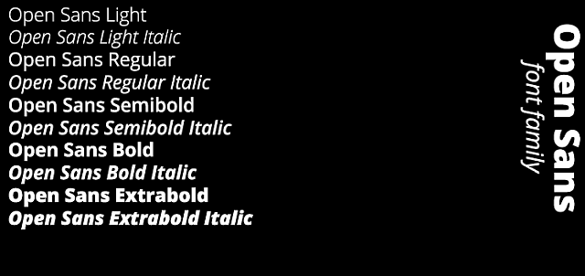
The zipped archive contains a number of font styles for Open Sans :

From the moment you install it locally, you are also able to use it normally, in any Windows application you desire.
Like it a lot? You can even set it as your default browser Sans Serif font. Enjoy.
Famous Last Words
Banner image is a Photo by Mr Cup / Fabien Barral on Unsplash
Special thank you to all the folks behind the SLOWLY app.
Letters we share, with pen pals all over the world. A modern day take in the traditional penpal experience. Come and join us, using SLOWLY.
Follow Blog via your Fediverse/Mastodon account :

@friends-near-and-afar-letters-we-share@wordsmith.social
This page created in MarkDown language. Thank you for reading, feel free to comment, via a direct message to my Twitter account – or the Reddit one.
You can also post a public comment in the Reddit thread for it here.
 yann2@bsky.social